Gallery

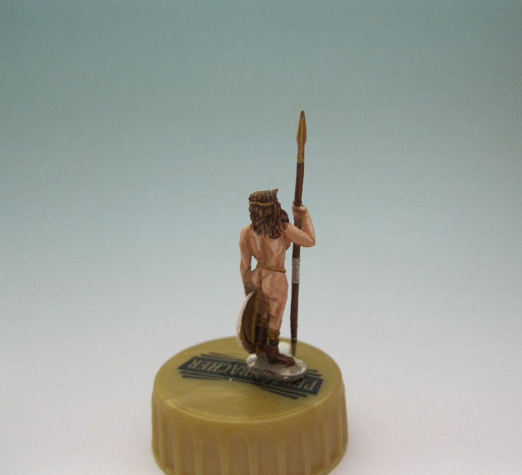
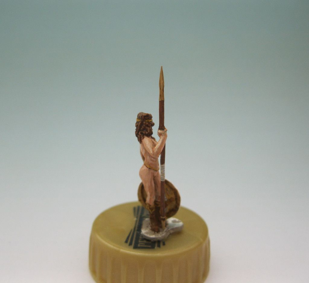
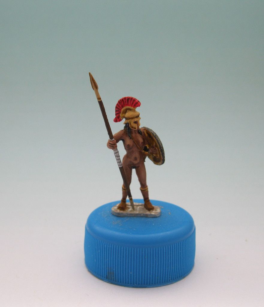
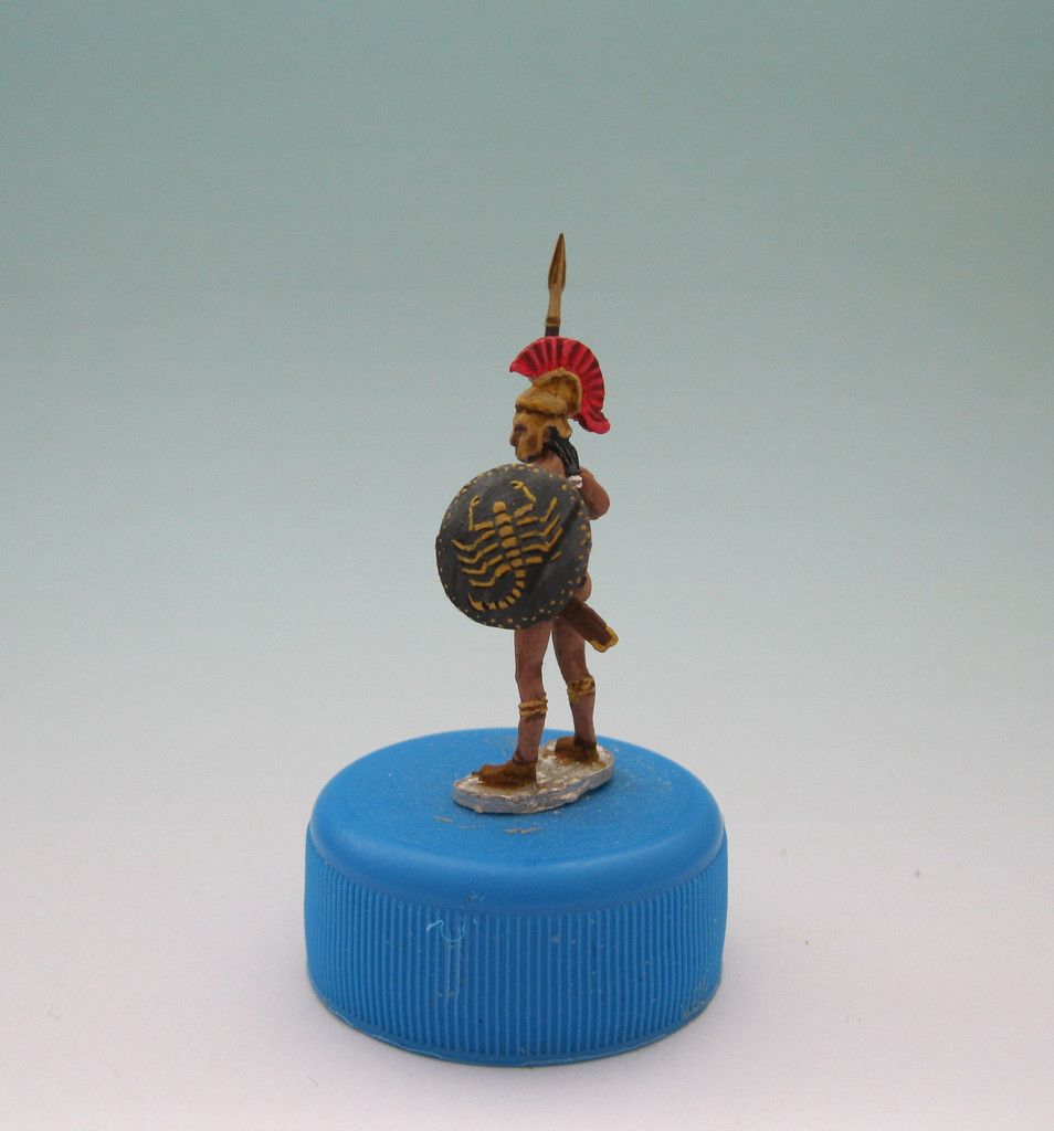
Amazon warrior

Posted by Zed1 on 14 Aug 2016, 22:17

Well. This posting has something to do with nudity, so beware.
Back in 2012, DannyC, who has been a quite active member back in the times around 2009-2012, posted a project of his: female amazon warrior figures in 1/72 (http://bennosfiguresforum.com/viewtopic.php?f=11&t=10533&hilit=amazon+warrior#p126569).
To be honest, I didn't remember that thread. Ancients are usually not my piece of the cake.

But at the end of this years' FIGZ, Mabo gave me a gift. A very unusual gift: a six figure set of amazon warriors which I remembered to have seen before but didn't know where and why. Nevertheless, I was very grateful about this present, because for a long time, I intended to get myself for training reasons some figures that where more or less nude. The reason for that was especially the challenge of painting naked skin. Clothes are more or less simple - you paint the basic colour, fill up the deeper parts of the folds with shadows and highlight the upper parts of the folds. Done.
I case of skin, this is a wee bit different, because the shadowing/highlighting process follows the lines of the body and the more you get away from the original, the more the human eye will notice the difference. Too much deviation might just ruin the whole result.

So that's why I actually had a lot of respect - if not anxiety - for this matter.
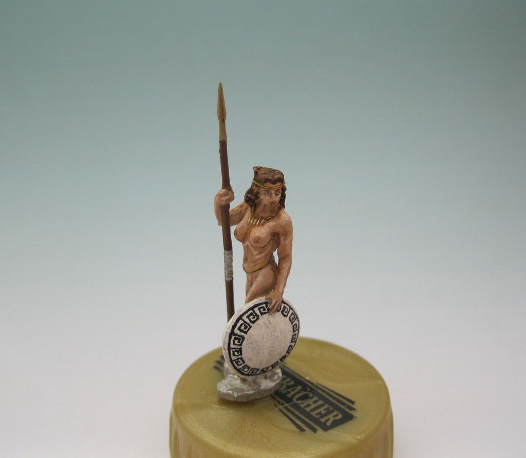
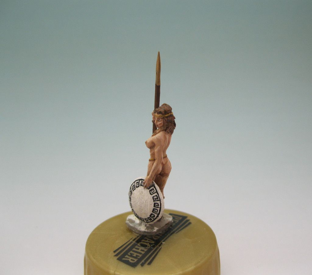
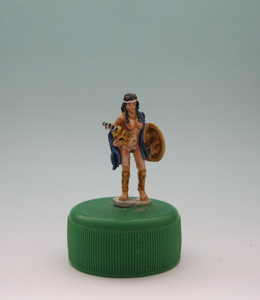
Finally, I had the right figures for training. Now here's a result, I wait for your feedback. :-D
Image
Image
Image
User avatar
Zed1  Germany
 
Posts: 1303
Member since:
17 Jan 2011, 14:25


Posted by Peter on 14 Aug 2016, 22:22

You did a great job, but for me she looks old and skinny like you painted her here. I think you overshaded her. Just my opinion! Let's hear what the other members say about her! ;-)
User avatar
Peter  Belgium

Moderator Moderator
 
Posts: 22750
Member since:
25 Mar 2008, 18:51

Posted by Ben90 on 14 Aug 2016, 22:46

I agree, but takina away some shading on the face an stomach should fix it. But the overall look is pretty good!
User avatar
Ben90  Germany
Golden Brush Winner
 
Posts: 1517
Member since:
28 Apr 2011, 23:32

Posted by MABO on 14 Aug 2016, 23:19

You should post the others as well...
User avatar
MABO  Europe
Supporting Member (Gold) Supporting Member (Gold)
 
Posts: 9170
Member since:
12 May 2008, 18:01

Posted by Roland_Kupski on 15 Aug 2016, 06:11

Woman's skin means the biggest challenge in painting figures. The balance of light and shadow is fiddly. The skin of woman contents more red/pink, so the shadows must contain a drop of green. And I am quiet sure, that in antiquity (like mostly today) women are "shaved".
User avatar
Roland_Kupski  Germany
 
Posts: 509
Member since:
20 May 2008, 20:10

Posted by Zed1 on 15 Aug 2016, 06:21

@Peter:
Well - 'old' is intended, because she's the one in command. 'Skinny' not that much. I found it different to pronounce the shadowing because the figure itself is in comparizon very large and slender.

@Ben90:
Good point. I'll try to refurbish the stomach region and see what it does.

Roland_Kupski wrote:Woman's skin means the biggest challenge in painting figures. The balance of light and shadow is fiddly. The skin of woman contents more red/pink, so the shadows must contain a drop of green. And I am quiet sure, that in antiquity (like mostly today) women are "shaved".


Er... is there any proof for that shaving sort of thing? Except from pictures on ceramics which I think are rather symbolic because the other way round, men would have to go into battle naked as well. ;-)
I find your description word 'fiddly' more then correct, it is. That's why I was so afraid about that subject in the first place. But 'green' is an astonishing suggestion - green is what I would have thought about at the very last position. What tone of green would you suggest? And which sort of colour mixture in general?
User avatar
Zed1  Germany
 
Posts: 1303
Member since:
17 Jan 2011, 14:25

Help keep the forum online!
or become a supporting member

Posted by Zed1 on 15 Aug 2016, 06:49

MABO wrote:You should post the others as well...


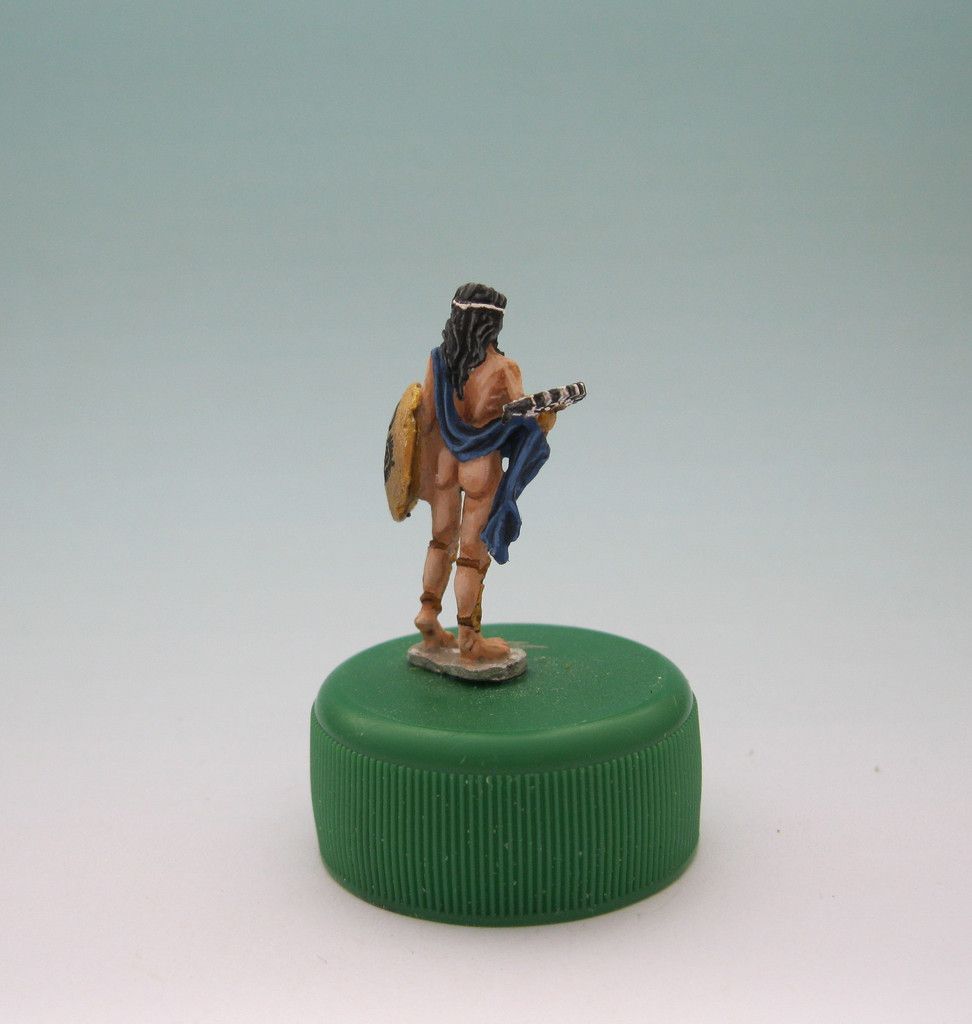
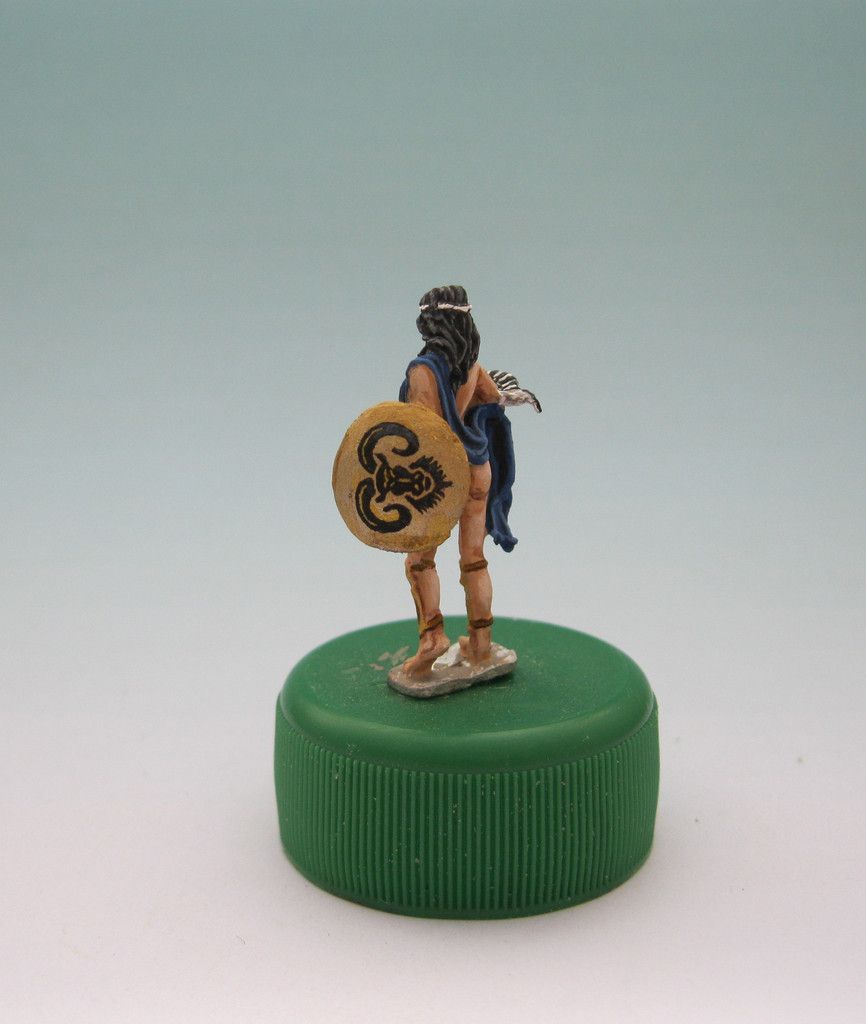
Maybe you're right. There are certain issues about these figures. One is that - as always when men sculpt women of fantasy scenarios :eh: - these girls are quite busty. In fact, they are more busty then they should be, when compared to the overall shape of their bodies. What I have already learned is the understanding of the highlighting effect 'round the belly region.

Well. To describe what I mean, here are some more pictures.

Image
Image
Image
Image

In regard to the pose, this is an impressive figure. Now have a look at face and stomach - in fact, this woman is skinny. The belly lies flat under the chestbones which means that in this pose, you have to pronounce the ribs. In addition, look at the highlighting position at the cheeks - from one side, it looks okay, from the other side, it doesn't look too good.

On the other hand - if I look at athletically trained women, their lower regions mostly look like that.
Image

(Plus: it's rather unusual for these female athletes to be that busty at all... :xd: )

Personally, I find the following figure more balanced - she looks smoother in proportions. I didn't put the same level of detail into her, because she's going to be more or less a background figure.

Image
Image
User avatar
Zed1  Germany
 
Posts: 1303
Member since:
17 Jan 2011, 14:25

Posted by Susofrick on 15 Aug 2016, 07:44

There are some nude people in Valdemar's set "Medieval bath". And their bodies are a little more realistic. And you get a man too. :-D But for training painting these probably work fine. And that first woman, well, even amazons got older. At least the good ones!
User avatar
Susofrick  Sweden
Supporting Member (Gold) Supporting Member (Gold)
 
Posts: 7713
Member since:
19 Feb 2008, 12:10

Posted by Roland_Kupski on 15 Aug 2016, 08:56

It's a question of theory.
Skin is a mixture of white, red an yellow. ("White" always means - concerning to sunlight - also a very pale, yellowish white).

Shadow means: the opposite colour (in terms of painting. Graphics and drawings use black and grey), So: the opposite of yellowish sunlight is violett (an NOT black!), the opposite of red ist green.

So the perfect shadow for skin ist a mixture of violett and green. Look at paintings of the old masters!

So the yellow-violett mix will result in a greenish brown.

In fact: I use a mix of burnt siena and russian green (in traditional terms), highly thinned down of course, for shadowing womens skin by mixing this colour step by step into the basic skintone or as an ink.

In terms of Vallejo: Read leather 70.818 and Russian Uniform 70924. For darker skin you can also use burnt umber (which is al little greenish by its own) instead of burnt siena.

Mix this until you get a "muddy" greenish brown.

Look at my naked girls in my blog and you can test if you like the look.

More simple for faster painting: use a flesh-shade ink and mix it with a tiny little bit of dark green ink. Try!

Highlighting: use ivory/bleached bone (not white!). Normally the skin reflects sunlight (=yellowish).

Mens skin - beeing more yellowish - needs a twinkle of blue (!). Most of the flesh-shade inks are made for mens body and don´t work for girls for this reason: it doesn´t fit to the ground-colour.


And: the more skinny the figure, the harder the contrast. This type of shadowin works only for little scales, 1/72 to 33 mm.
e,g,;
http://figurenwelt.blogspot.de/2016/04/lindwurmlady-valdermat-figures.html

an my figures postet under "medieval town and fortress" in this forum.
User avatar
Roland_Kupski  Germany
 
Posts: 509
Member since:
20 May 2008, 20:10

Posted by Peter on 15 Aug 2016, 12:36

Reading this topic with great interest and I'm learning a lot. I must say I like the girls a lot, and those two you added are better painted (personal tast) as the first one. :-D ;-)

With one thing I agree completely, painting flesh is very difficult!
User avatar
Peter  Belgium

Moderator Moderator
 
Posts: 22750
Member since:
25 Mar 2008, 18:51

Posted by Roland_Kupski on 15 Aug 2016, 13:39

Yes. I forgott to say, that the two newer are better.
User avatar
Roland_Kupski  Germany
 
Posts: 509
Member since:
20 May 2008, 20:10

Posted by Zed1 on 15 Aug 2016, 16:29

Well - thanks a lot, friends. I now have a lot of input that should help me with the next try.
Plus I'm not afraid of that subject anymore.

You never stop learning. :-D
User avatar
Zed1  Germany
 
Posts: 1303
Member since:
17 Jan 2011, 14:25

Posted by Ben90 on 15 Aug 2016, 17:18

Yes, the newer ones are great! I like them very much!
User avatar
Ben90  Germany
Golden Brush Winner
 
Posts: 1517
Member since:
28 Apr 2011, 23:32

Posted by Roland_Kupski on 16 Aug 2016, 14:01

http://www.realhistoryww.com/world_history/ancient/Misc/True_Negros/Assorted/Paintings_3.htm

Heavy nude content. A wounderful collection of painted naked girls in oriental style. Look for the shadows ;-)
User avatar
Roland_Kupski  Germany
 
Posts: 509
Member since:
20 May 2008, 20:10

Posted by Zed1 on 16 Aug 2016, 17:26

I guess I understand what you mean, Roland. For the next try, I need those oriental dancers... :-)
User avatar
Zed1  Germany
 
Posts: 1303
Member since:
17 Jan 2011, 14:25


Return to Gallery